Let’s get started 🚀
This section provides a consolidated view of key metrics across the platform, helping you understand overall activity and trends at a glance before diving into specific areas.
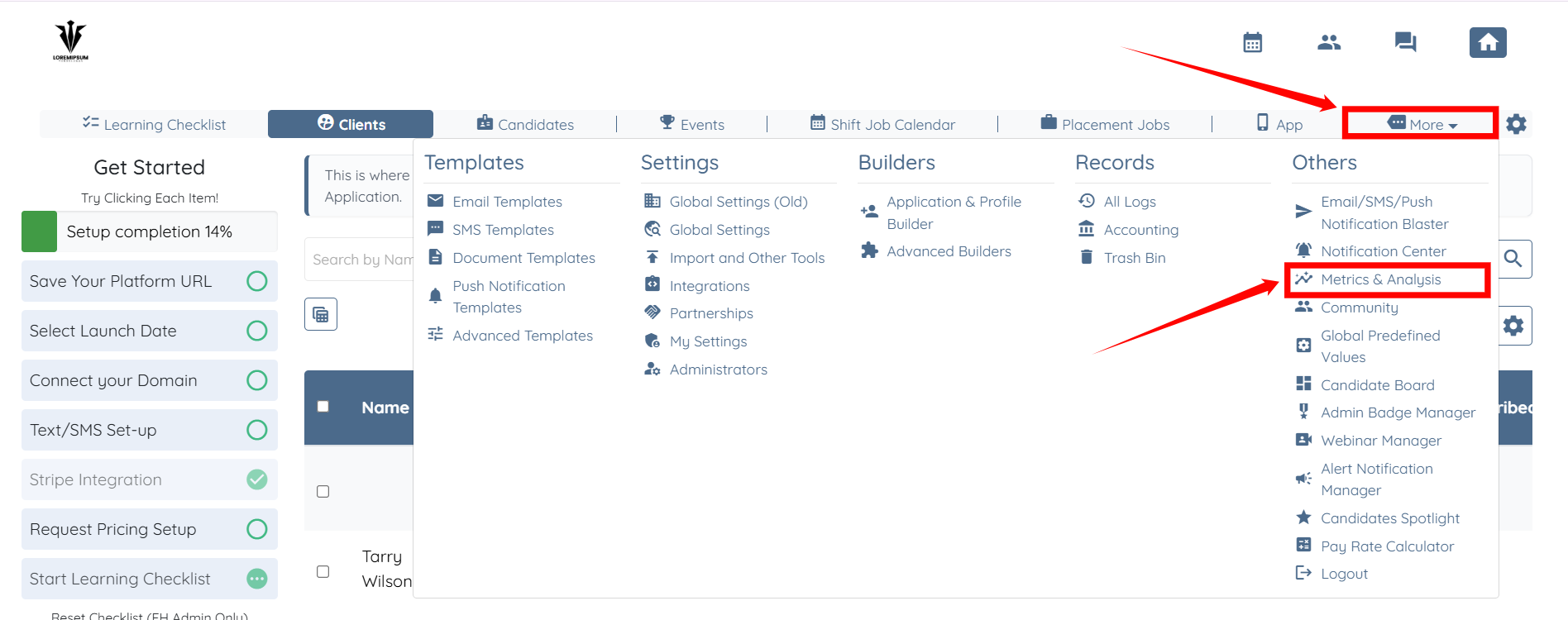
Step 1: Log in to your agent dashboard, then click More > Metrics & Analysis, as shown in the screenshot below.
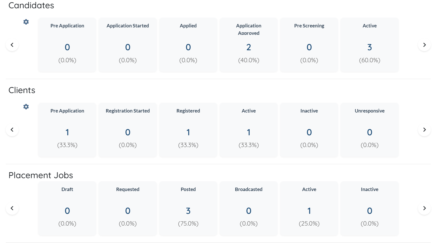
The Candidates section provides an overview of where candidates currently sit in the recruitment pipeline. It displays counts and percentage distribution across different statuses such as Pre Application, Application Started, Applied, Application Approved, Pre Screening, and Active.
This view helps you understand how candidates are progressing through each stage, identify drop-offs or bottlenecks, and quickly assess how many candidates are fully active and available.
The Clients section summarizes the status of clients within the platform, showing how they move through registration and engagement stages. It includes metrics for Pre Application, Registration Started, Registered, Active, Inactive, and Unresponsive clients, along with percentage breakdowns. This allows you to track client onboarding progress, monitor engagement levels, and identify clients who may require follow-up or reactivation.
The Placement Jobs section highlights the current state of placement jobs across their lifecycle. It shows how many jobs are in Draft, Requested, Posted, Broadcasted, Active, or Inactive status, along with percentage distribution. This helps you quickly evaluate job activity, understand how many roles are live or in progress, and spot gaps where jobs may not yet be broadcast or activated.
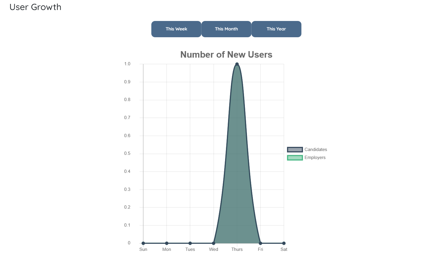
Step 2: Scroll down to the User Growth section, where you can see how the number of new candidates and employers grows over time. The graph allows you to switch between weekly, monthly, and yearly views to analyze user growth trends across different time periods.
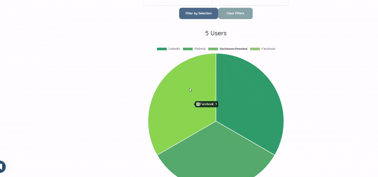
Step 3: Scroll down to the Marketing Impact section to see how candidates and clients discovered your agency across different sources, such as social media platforms and referral channels. This view helps you understand which marketing sources are driving user sign-ups.
You can filter the data by candidate or client status to narrow the results. You can also use the Start Date and End Date filters to analyze marketing impact within a specific time range.
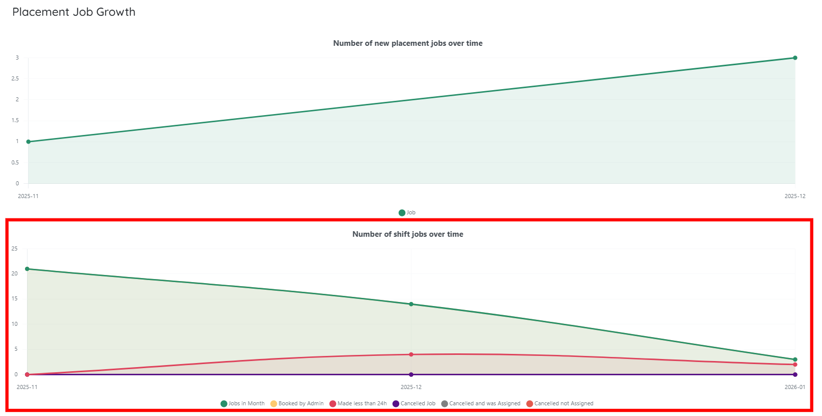
Step 4: Scroll down to the Placement Job Growth section which visualizes how job activity changes over time using two separate graphs: placement jobs growth and shift jobs activity. Together, these charts help you track job creation trends and understand how shift jobs progress and change status over a selected time period.
The Placement Job Growth chart at the top shows the number of new placement jobs created over time. Each data point represents the total number of placement jobs added within a specific month. An upward trend indicates growth in placement job creation, helping you quickly assess whether demand for placements is increasing or decreasing.
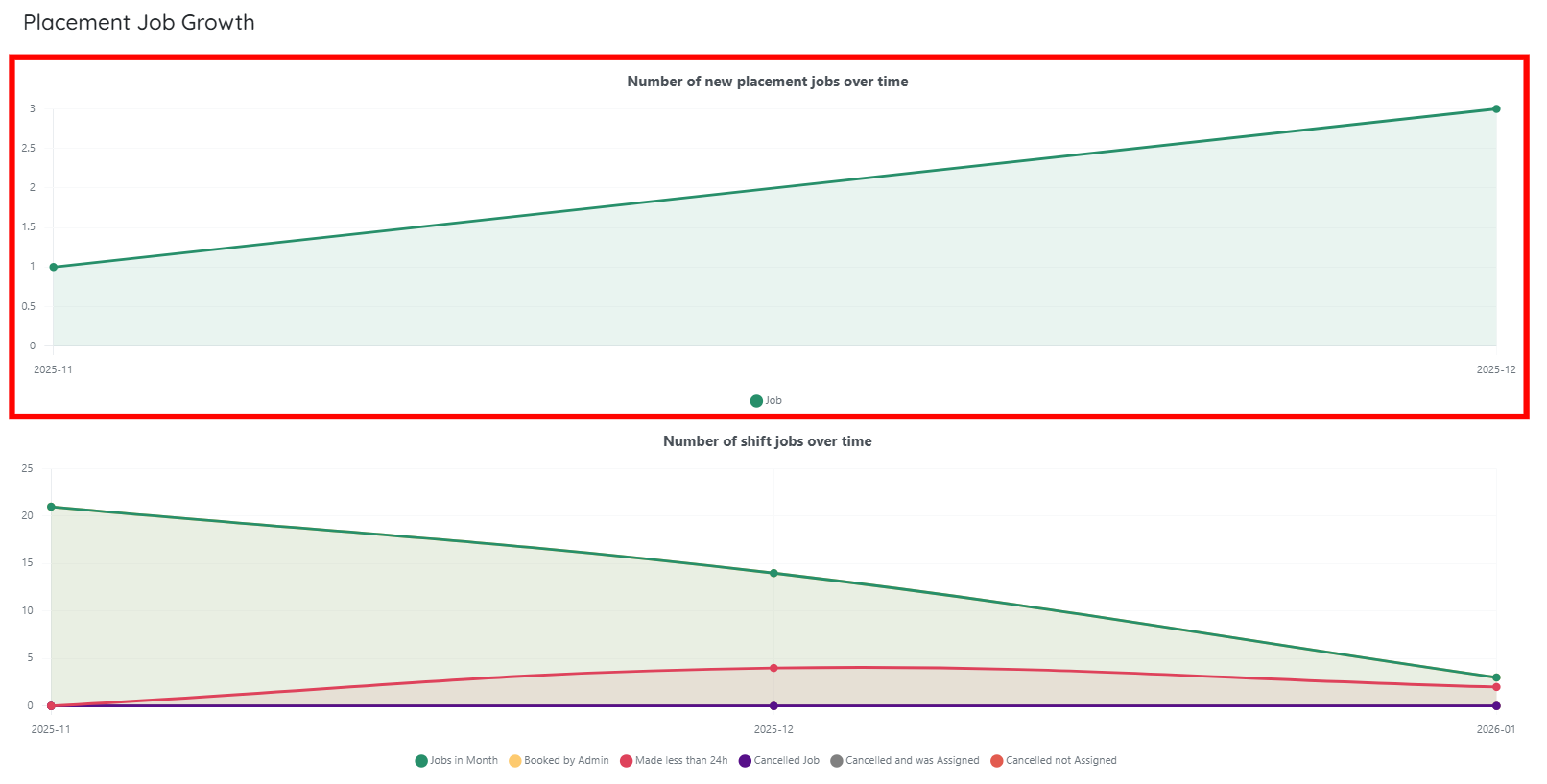
Below it, the Shift Jobs Over Time chart provides a more detailed view of shift job activity across multiple statuses. It tracks how many shift jobs were created in each period and how those jobs progressed, including jobs booked by admins, shifts created less than 24 hours before start time, cancelled jobs, cancelled jobs that were reassigned, and cancelled jobs that were not reassigned.
Review analytics related to placement jobs to understand job creation trends, status distribution, and overall placement activity over time.
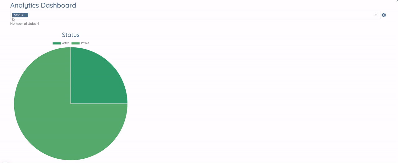
In the Placement Jobs section, click the Analytics Dashboard button, as shown in the screenshot below.
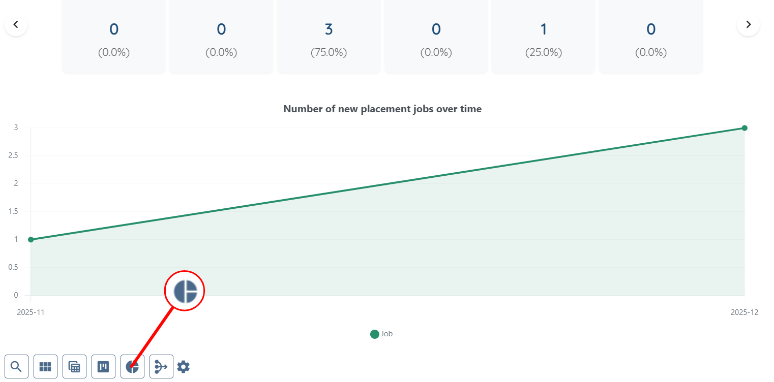
This section displays placement jobs grouped according to the field you select from the dropdown. For example, when you select Status, the system groups placement jobs based on their current status.
This view helps you quickly understand the current state of placement jobs and identify how many jobs are active, pending, or completed.
You can change the selected field from the dropdown to group placement jobs by different attributes and analyze job data from multiple perspectives.
View candidate-related metrics to analyze application progress, profile attributes, and how candidates move through different stages of the recruitment pipeline.
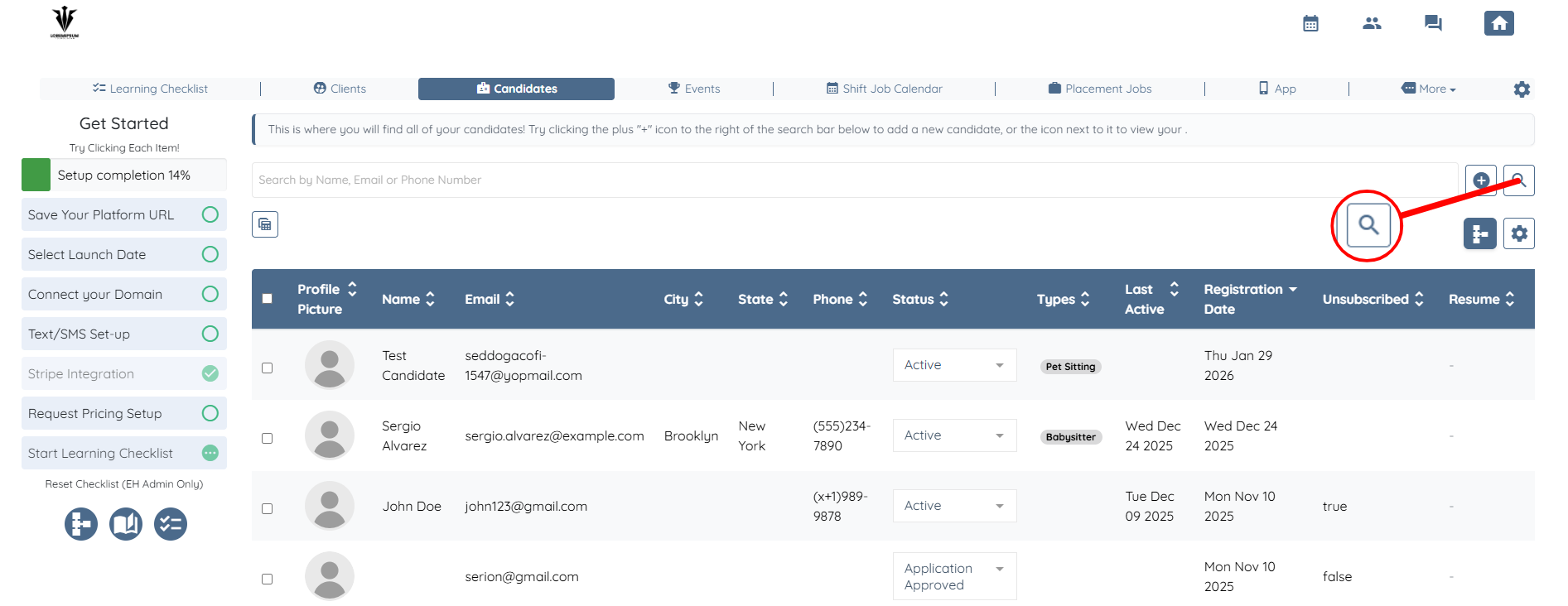
Step 1: In the Candidates section, click the Search and Filter Tools button, as shown in the screenshot below.
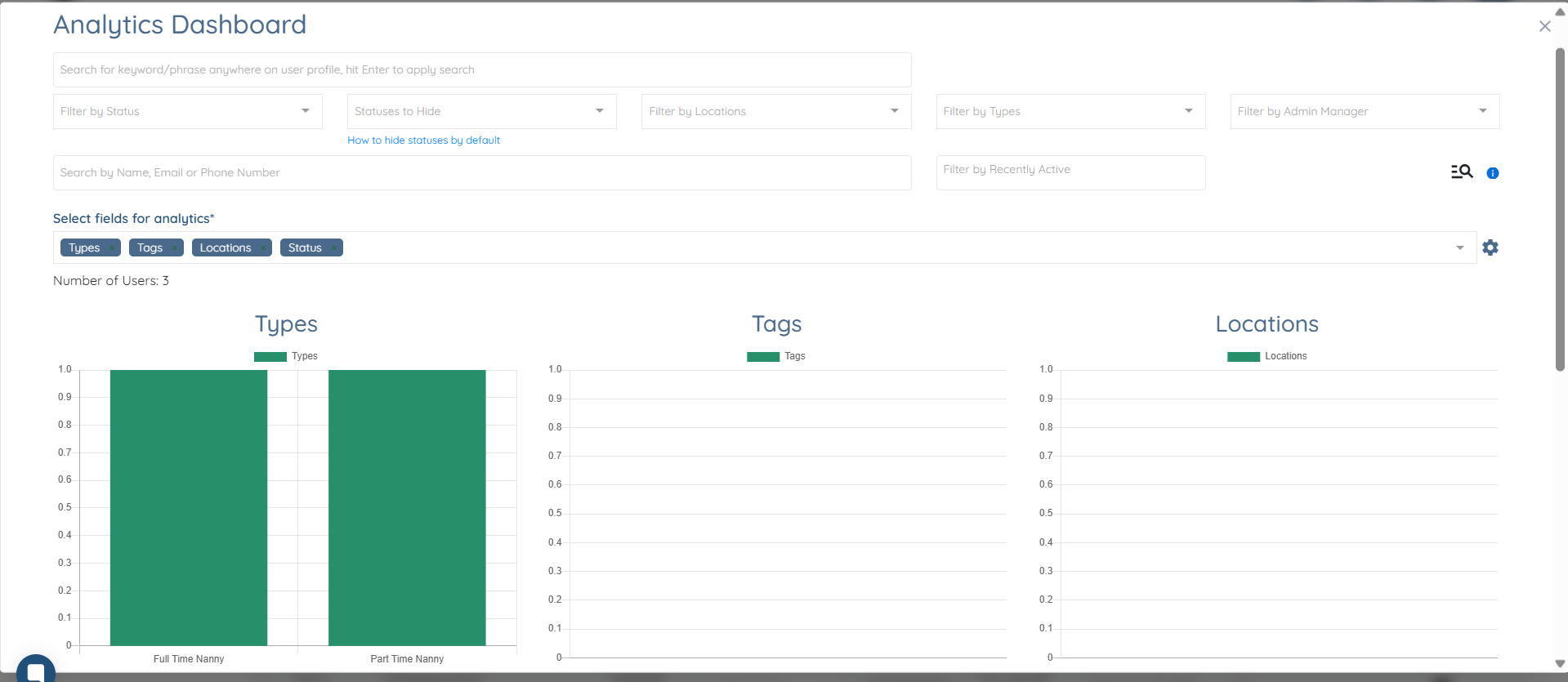
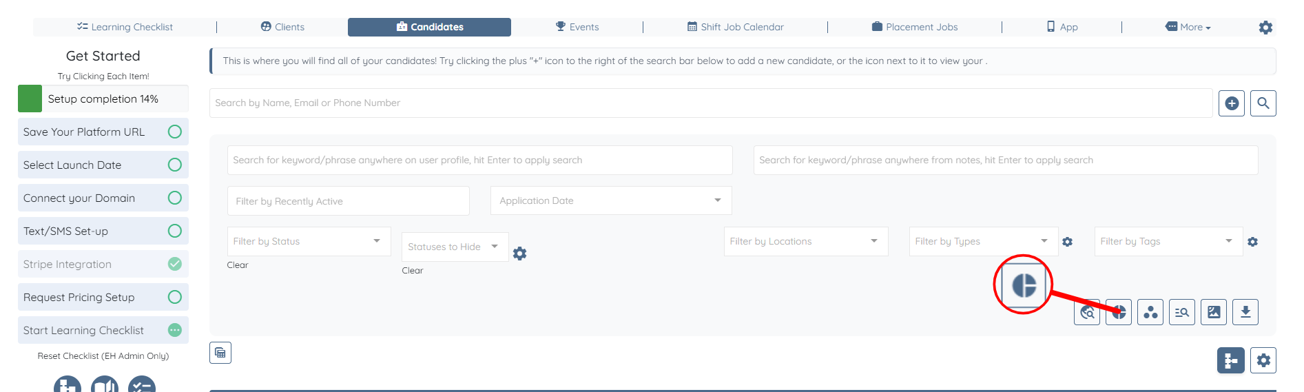
Step 2: Click the Analytics Dashboard button to open the candidates’ analytics.
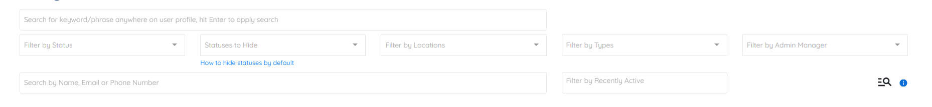
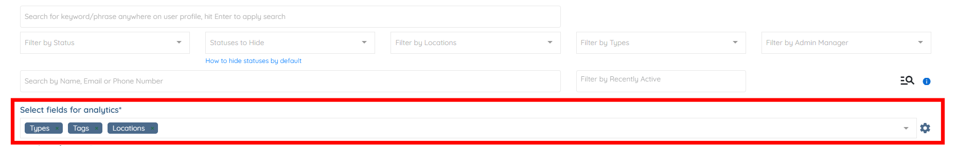
This view provides a detailed breakdown of candidate data based on selected profile attributes. At the top, you can filter candidates using multiple criteria such as status, locations, types, admin manager, and recent activity, or search directly by name, email, or phone number. These filters help narrow the dataset before analytics are calculated.
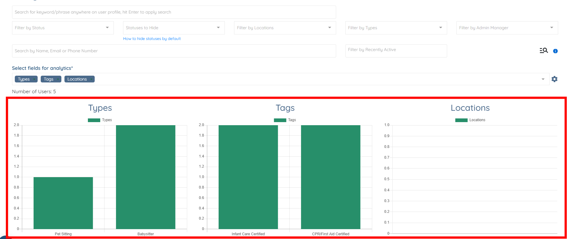
Using the Select fields for analytics option, you can choose which candidate attributes to analyze, such as Types, Tags, and Locations. The system then calculates analytics only for the filtered set of candidates and displays the total number of users included in the analysis.
Below, visual charts present how candidates are grouped by the selected fields. For example, the Types chart shows how candidates are distributed across different candidate types (such as Babysitter or Pet Sitting), while the Tags chart highlights certifications or attributes like Infant Care Certified or CPR/First Aid Certified. The Locations chart displays how candidates are grouped by location, if location data is available.

Analyze client metrics to track onboarding progress, engagement levels, and how clients are distributed across different statuses and attributes.